I’m sitting here but I’m blown away!

This is awesome: Last night I write a post that I could really use some help in evaluating my book on happiness at work. 12 hours later, almost 40 people have signed up to help. This absolutely rocks!!! This is why I blog.

I’ve always believed that everything we need is all around us – if we dare look for it instead of always struggling alone.

I have one more question for you: A cover. I asked the incredibly talented Lone Ørum to come up with something, and here’s my favorite of her suggestions. What do you think?

Book cover?
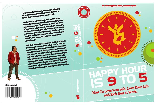
Click for larger size

This is only a draft, so the image is a little choppy. What do you think?

17 thoughts on “I’m sitting here but I’m blown away!”

  1. I am really looking forward to this book! In fact, I did not want to review the book only because I am excited about buying a copy (I want a printed copy).

    But…

    Generally, I think this blog is about making people happy AND increasing productivity. If I were to judge a book by it’s cover, I would say that this is a self help book. More about getting people to enjoy their work rather then telling managers how they can improve the work environment. Based on the cover, I would not buy this book without a strong recommendation.

    I think it is the subtitle. Anything that says “How to…love your life” is just a bit too much for me. Just from the front cover, why would someone who is already happy at work buy the book? I think Chief Happiness Officer is a great line…maybe you can use that somewhere?

    …or maybe I do not know your target audience.

    Just my 2 cents.

    Toby

  2. Picking up on Toby thoughts… don’t forget the managers.

    Recently I bought “The Seven-day Weekend: A Better Way to Work in the 21st Century” by Ricardo Semler to distribute to our team.

    Are we, Team Leaders / Project Managers, (also) your target audience? And if so, where in the book cover do you address to us?

    did I help? good luck with your book

  3. I used to be a graphic designer, so I can’t help myself. Also, I like this project. :)

    A couple of notes:

    1. I think the bluish-green color isn’t happy enough. I would go with either a warm color (reds-oranges) or a funky green (bright acid).

    2. I would color “Happy” or “Happy Hour” on the title the same red as the “9” and “5”. Either way, the visual accent should be always lean towards “Happy”.

  4. I think the layout is great!
    Catches the spirit of the book – don’t change that!
    Don’t make the colours too “funky” – keep it sparkling but serious ;-)
    But I agree with with Uri’s second comment. In my words: “Happy hour” needs to stand out more on the cover.

  5. It’s definitely fun – I’d agree with the comments about moving to a warmer colour scheme, and maybe it’s a bit too busy – but I most certainly like it!

  6. The picture of man-clock is great.
    Yeah, I don’t like green either.

    And white font of the title makes is look like a hole… not sure this was intended?

    And make Chief Happiness Officer a little bit bigger!

  7. Alex!

    I love the cover, totally captures your spirit and the spirit of the book! My only comment is to make the yellow brighter, less gold. . . Otherwise, it’s perfect! ;-)

  8. People tend to expect the author’s name to be toward the bottom of the cover when it’s smaller than the title. It’s also more important than this design accounts for!

    I agree with the color scheme problems. Read the title on the thumbnail — what jumps out? “9” and “5”. Remember that if your book is going on Amazon and friends, a thumbnail is all your potential customers are going to see when they’re browsing.

    Lastly, the subtitle doesn’t make me want to pick it up. I don’t know if it’s about improving my current situation or about leaving a job to find a better job elsewhere, and that’s a big distinction to make.

    (Also, have you given consideration to the primary meaning of “happy hour” as a time to drink?)

  9. I’m sure values vary from location to location, but with my American sentiments, the cover doesn’t really grab me. Also, maybe it’s just me, but until a commenter said they liked the happy man inside the clock, I didn’t realized what that was supposed to be from my quick glance. I like the general idea of the picture, and it goes well with the title, but I didn’t know what it was when I first looked at it.

    As others have said, not digging the color scheme, although on the monitor I’m looking at this with, my colors/contrast can be WAY off, so I’ll have to take another look at home (I refuse to sit anywhere else than the sunniest spot with the sunroof over head and a view of the trees outside with more sunny spilling through). Personally, I like the “Good to Great” styling, and I think that was a powerful cover for a powerful book. Maybe you could do a compare with some book covers that have grabbed you?

    As a final note, and on the upside, I do really like the author text at the top for whatever reason.

  10. Thanks for all the great feedback. I had another meeting with the designer today, and your ideas were a great help!

    Toby & Alfredo: You’re right, managers are in the target also, but are left out of the subtitle. Damn, I’ll have to fix that. Any ideas?

    Uri & Anne & Silvia: We’re changing the colors a little to accentuate happy hour.

    Mary & Shel: You should see some of the other design suggestions – they were even wilder :o) I’m glad you like it overall.

    Pauly: I agree, CHO needs to be a little bigger.

    Traci: Thanks!!

    rich: The book is both about making your current job happy or moving to a new one – whatever it takes to make you happy at work. Of course happy hour is about drinking but I’m hoping people will know that I’m talking about less alcohol-driven good times here :o)

    MyNamesIsMatt & Nneka: Wanna know something funny: The little man is not even intended as a clock :o) Funny what we see when we look.

  11. I think I’m a little late. Anyway…

    I like your book already, so I asked someone (a former boss) who didn’t know about it what does he think about it. I’ll try to summarize.

    [Since we don’t work from 9 to 5] the title doesn’t say anything special to me this may or may not be a problem depending on your target audience in which, in fact, be the common denominator

    The thing about the happy hour and work caused a little confusion (but then again, that’s maybe what you want :)

    The white title is lost against the pale green background.

    The “kick butt” thing may lead to people to question the seriousness of the info. In the other hand, it may be something refreshing in the middle of a bad stroke (and here is where I read again the whole e-mail and realized that cheering-up is in order)

    Looking forward for this book

  12. I might be too late, but I’ll leave my comment!

    Concerning the layout:
    * The design signals happiness and spirituality to me, and I like that very much. However, as Toby mentioned, it might signal selfhelp book and in that way scare off some of the potential audience. Maybe those who would benefit the most…
    * One way to avoid that might be to go for a darkish, “serious” blue. Personally, I’d like purple, but again, that would probably signal self-help. Which it is, of course, but… I guess you know what I mean. Also, the dots could maybe be turned into something a bit less “spiritual”, and more “bubbling”.
    * I agree with Jach that the white title is lost against the background – that might be helped with a darker background colour.
    * I’d use another picture on the back – even though you’re standing straight, you seem to hunch,which seems like a contradiction to your messages. Somehow, one has to think a while to realize that the reason is that you’re in deep thought.

    I agree with the other bloggers that the title might be problematic. I suggest using the plural: Happy hours are… / 9 to 5 are happy hours! / Work hours are happy hours!
    The subtitle? I have a problem with the “how to”. To me, it makes the book seem (too) simplistic, a bit like the Mars – Venus books. A few ideas:
    * You profit – they profit (might bring it up in a web search for profit – and it’s neutral. No matter your perspective (manager / employee), you’re in)
    * Everybody profits
    * Life and profits work together / co-work
    * Make life and profits work together / co-work

    Have fun with your further work!

  13. I agree with PAULY. Definitely make Chief Happiness Officer bigger. I think that that was a really clever title to give yourself and would go a long way to selling the book. I imagine that a book reviewer would pick up on that phrase and use it in a review. Furthermore (and this is a minor point) I would make it “The Chief Happiness Officer”. I love my articles.

    Either way, I’m looking forward to receiving your draft soon!

  14. The title totally draws me in Alex! If you believe that statement, I think your response is “Cool, someone who agrees with me that work is great!” If you disagree, I think you’re tempted to pick up the book thinking, “Yeah right. This person’s crazy…BUT maybe there’s something in here I don’t know.”

    I think the funky, hip, non-traditional layout will be appealing to Cultural Creatives and younger people. Not sure a C-level exec or conservative manager will be as likely to pick it up. So, depending on your desired audience you may want to make some design changes.

    Looking forward to receiving my copy! Peace.

Leave a Reply

Your email address will not be published. Required fields are marked *

This site uses Akismet to reduce spam. Learn how your comment data is processed.