36 thoughts on “Help me choose a cover”

  1. I’d suggest going with number 2

    Sadly its the least eye catching but…
    1) suggests you’re promoting drinking at work
    3) just looks painful (yoga or gymnastics)

  2. I would go for 2 too! Looks more professional and as Will said cuts the booze and the strenous exercise option out! :)

  3. I also prefer 2. I like the smile in the clock and the hands becoming (for me) an extravagant moustache.

    I agree 1 looks like he’s drunk and 3 is, despite the highkick a little lifeless.

  4. 1 is… special. More time for AA meetings? ;)
    2 is very clean, you can’t go wrong with that.
    3 is also good, but has interesting proportions. o_O

  5. I actually liked the 1st one but agree that the drink may be a problem.

    The 2nd one is my next choice but I find the whole 3D thing hurts my brain – maybe I have a sensitive brain today :)

    I don’t think of “happy” for the 3rd image – instead I have Austin Powers saying “Kung Fu Kick” in my head.

    I need another coffee.

    Cheers,
    Gwynn

  6. Alex –

    I saw “Help me choose a cover” and my first thought was that you wanted advice going undercover as a spy.

    Seriously.

    Time to switch to decaff.

  7. I would also go with 2 – for all the reasons others have so eloquently expressed. It is bright, and eye-catching, gender neutral and does not suggest either the need for booze to make you happy or a parody of a goose-step a’la Monthy Python’s Ministry of Silly Walks!

    Congratulations and may the royalties pour in – and pay for your wedding! :)

  8. Hi Alex,

    number one looks like an alcoholic :)

    Number two looks happiest, due to the colours.

    What catches my eye in both 2 and 3 is that the happy hour seems to go from 3 to 9 or from 9 to 3 :)

    I would go with number 3 and extend the red letters of Happy Hour until 5pm. (Or maybe the portuguese version doesn’t say “from 9 to 5”? Then it might be irrelevant.)
    And if the acrobatic figure would resemble more the “happy jump” of your English cover (and yourself on the top left of your website here), it would be more “you” I think.

    Just to make things complicated. :)

    Anja

  9. I choose number 2 because it is simple and has nice colors.
    I feel that 1 and 3 further advocate the male dominated society and since your book can apply to all that would be my suggestion. Unless, of course, you go with Selfcoachingcards’ suggestion of putting yourself on the front.

    Just my 2 cents :)

  10. I’m going to have to buck the trend, and say I prefer #3, hands down. #1 looks dated and simplistic…and yes, I don’t care for the alcohol implication–it’s too overt. #2 is a frenetic and and (to me) completely unappealing design–it feels “all over the place”–it took me some time to even realize that there was a “happy face” there. If I saw that cover on a book, I’d put the book down, before even bothering to try to figure out what it was.

    #3, however, is a tight, inverse triangular design, where every part reinforces the idea of “happy hour”–the hour…the man’s hands being part of the clock–and a man in a suit, kicking up his heels in joy. (As a former actor, his kick seems quite normal–something I’d expect to see a man doing on stage, to show ebullient spirits, so I didn’t think itl looked painful at all. ;))

    I suspect what would REALLY be germane is how Portuguese business people react to the cover, as opposed to how a female American artist reacts! :)

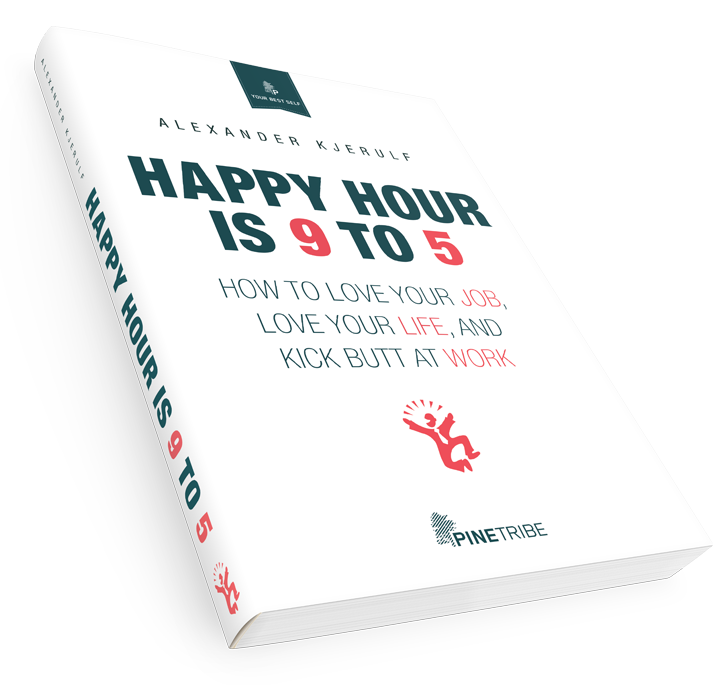
  11. #2.
    –It’s clean, therefore happiness at work can bring order.
    –It has simple, happy colors, reflecting that happiness at work is simple. Primary colors remind us all of youth, where we were allowed even encouraged to play often. Playful = happy
    –The tag line is at the bottom, not on the top… page text flows better.

    Something about the tan color in both 1 & 3 is not working for me… Also, both guys look bizarre – either rumpled/drunk or too 90’s/clipart-y.

  12. Dear Alexander,
    I lived and worked as a director for Portuguese companies in Lisbon for ten years and I am sure your book will have an impact in the Portuguese society and business environment. However, I believe the covers inadequate. The line between fun and happy is thin and in Portugal, especially, business is serious. I would choose a cover with the concept of soberness, lightness, seriousness and only a hint of dynamics. And avoid the yellow colour, which traditionally was considered to be “bad taste” in Portugal.
    With the best of wishes,
    Jesper

  13. I think the second one is the best… number 1 person has what looks like a wineglass in his hand which is not appropriate for work and number tree is too dull in colour sceeme.

  14. #3 (the happy dancing guy) – no question!

    #1 looks like cheesy 1960’s-era advertising art. The guy looks more falling-down drunk than happy.
    #2 looks like a “generic management self-help” book. Kind of reminded me of the One Minute Manager

    #3 is eye-catching, gets the “happy” idea across without the cocktail connection. It also ties in nicely to the covers of the other published editions. If the yellow/tan background is a problem in Portugal, you could always go with a crisp white background.

  15. hi,
    I like number 1, but maybe exept the martini glass. For me th guy look really happy. And if you can take out the glass, it looks like he’s happy about the work, not the martini.

  16. Just to clear up some things; the book in question is being published on the Brazilian market (translated to Brazilian portuguese) – not in Portugal.

    Seriousness – or rather formality – in business is also an issue in Brazil, but they are very reluctant to loosen up quite fast (say, after 2 minutes ;-)). This is a tropical country of strong colors and formality doesn’t go that deep. In fact, it doesn’t go much deeper than the first greeting or the incomprehensibly formal business letter.

  17. Cover 2 is fun and bright – just like the Chief Happiness Officer!

    Although the guy on cover 1 looks pretty happy… that might be something to do with the martini glass in his hand! While the man on cover 3 could do himself an injury!

    If you put covers 1 and 3 together it’s like a binge drinking warning!

  18. I agree about the booze on the first so it’s not a good idea.

    The third one has an error on the clock, where the 4 in roman is written by “IIII” instead of “IV”. I saw a clock in this form once and people said that was a kind of special detail from the clock maker.

    The second is better.

  19. All of them are pretty bad. Perhaps the Porteguese like the “MS Word clip art” style? The cover for the English version is 100 times better. What happened?

  20. I’m from Brazil and would prefer seeing here a nice cover like the one you have in US. The 3 choices are pretty boring.

Leave a Reply

Your email address will not be published. Required fields are marked *

This site uses Akismet to reduce spam. Learn how your comment data is processed.